These days I alternate mobile operating system. Partly because as an app-making professional I strongly feel I need to understand both, and partly because it slightly irritates people who are die-hard fans of one or the other.
I don’t particularly love either – a plague on both their houses. I’d rather we all used a fully open operating system, or there was a lot more competition and a standard application platform. Still, they work, and both have lots of delights.
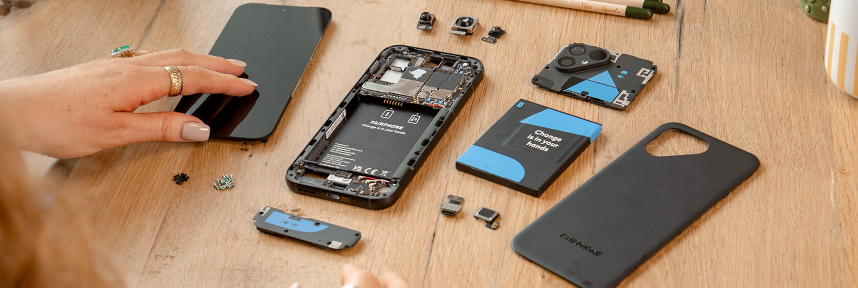
This time I jumped in order to have a Fairphone 5 which came out a month or so ago. It’s lovely in terms of hardware – conflict free materials, fair pay, all parts replacable with just a screwdriver (yes, even the USB port), feels and works beautifully. Highly recommended!

Of course all this fair hardware is only possible with Android, so chalk one advantage up to an at least partially open ecosystem.
This time I took notes on everything interesting I noticed while switching from iOS to Android. It is deliberately rough notes – I haven’t researched each one in detail. They’re impressionistic. Every sentence is in my instinctive opinion.
Winner for each section is represented by 🍎, 🤖 or neutral ⚖️.
Installation ⚖️
- Google/Fairphone screens felt more slick to me than Apple setup screens
- Android didn’t offer a QR code scan for Wifi password – I had to type it in
- It got me to plug my old iPhone into the Fairphone via a cable, and tried to copy various things across including WhatsApp message history, but it didn’t work for me. I didn’t need this so didn’t try too hard.
- Prompts me to choose my search engine – lovely, I guess Google are forced to do this? I picked DuckDuckGo
- Face unlock was very very fast and easy to register, and seems to work really well. Presumably though it is less secure than on iOS due to missing imaging hardware – all the banking apps and so on use the fingerprint recogniser on the power button, which works really well too.
UX Details 🤖
- Overall the user interface feels faster and slicker than my old iPhone 11
- Actions in notifications feel more comprehensive and easier to use on Android
- Android routinely has separate settings for different kinds of notification in one app, so you can configure them separately – if iOS does this I never noticed it, or apps weren’t adopting it as frequently
- Timer has more features, including a lovely one to make the sound come in gradually. And of course multiple timers.
- Pull down shade keeps audio players in it for longer, and you can swipe between them, e.g. music vs podcasts. Was frustrating how quickly this would disappear on iOS. When I’d just paused to go to an appointment, it was gone by the time I came out.
- Auto rotation is considerably better – when you rotate the phone sideways a little icon appears and you tap it to make the phone switch landscape/portrait. This is just much better for me than having a lock/unlock setting, which you have to unlock on the pull down shade, rotate phone, and then when you’re done lock again.
- Can choose the default mapping software (e.g. if you open a map link in one app). Wild that capitalism gets Apple to not offer this. Not clear why Google offers it!
- Bedtime mode has a cute option – my phone goes black and white from 11pm to 7am.
- SMS app has spam detection, and it works.
- When something is annoying, there is more likely to be a way to fiddle with it on Android. As an example, for some reason it showed an NFC icon in the top bar by default, which is useless as there is no reason to turn NFC off. In the end I switched to developer mode and typed things like “adb shell settings get secure icon_blacklist” and turned off the icon permanently.
Voice Assistant 🍎
- Apple’s better privacy encouraged me to start using Siri when I got my iPhone. Mainly for my own professional development in the era of AI, I ignored this problem and for the first time used Google Assistant on my Fairphone.
- It can’t listen in the background when the phone is off. This is a hardware limitation, only top end Android phones have that feature. At first this annoyed me, but now I’ve just stopped using voice assistants as they aren’t that good. It is set to listen while the power is on – so worse case I tap the power button once then talk to it.
- When I first started using it it felt fast, but now it seems often really slow, I’ve no idea why.
- It has the world’s most awful branded wake word. No, I don’t want to name a trillion dollar corporation everytime I use a user interface.
- It only uses Google Calendar, not my local synced calendar. I mean what, seriously?
- In theory it lets you enable access to personal things, and detect your voice. Because of the above problems I haven’t played with this much.
- Overall I’m very disappointed – I thought the company that wrote the first AI transformers paper 6 years ago would have a better voice assistant in 2023. I guess I’ll have to buy whatever Jonny Ive is designing with OpenAI, or some startup’s pin badge, or hack my hearing aids, or just leave ChatGPT Plus on like a phone call.
Email / Calendar / Contacts / Phone / Browser 🤖
- To my surprise, much more choice of email clients for me on Android. On iOS most of them required expensive subscriptions and funnelled all your email via their server, so I just used the standard client. It has a very dated interface. This time I picked the open source K-9 Mail which is both better than Apple’s offering, and I can make a PR to improve it if I like.
- Similarly, more choice of calendar app. My old favourite aCalendar+ means I have a weekly view that I like again (one page, 4 days on the left, 3 days on the right), something I couldn’t find on iOS at all.
- The contacts and phone apps have a better UI on Android. Partly this is just material design is a bit more thought through and clear than Apple’s strange blue outlines for buttons. Mainly it is because the worst team at Apple works on the phone app (example 1, example 2). For example, I had to search for how to reject a call when I first got my iPhone. While it was angrily ringing at me. They’re not trying, honestly.
- Apple monopolistically don’t let you change browser on iPhones – all the other browsers are mere skins around the same one rendering/Javascript engine. On Android I’m using actual Firefox again, with plugins! For some reason only some plugins are allowed right now, they’re bringing back the rest. Oh Mozilla, what are you doing!
Git / Files Support ⚖️

- I keep my personal documents in a git repository. One of my favourite apps on iOS is Working Copy, an excellent git client. I even scripted it with Shortcuts to auto-commit everything whenever I plugged in my phone. There’s nothing like Working Copy on Android. One thing iPhones excel at is software designed mainly for tablet users, as due to strategic Google errors there isn’t the same market for Android tablets as for iPads.
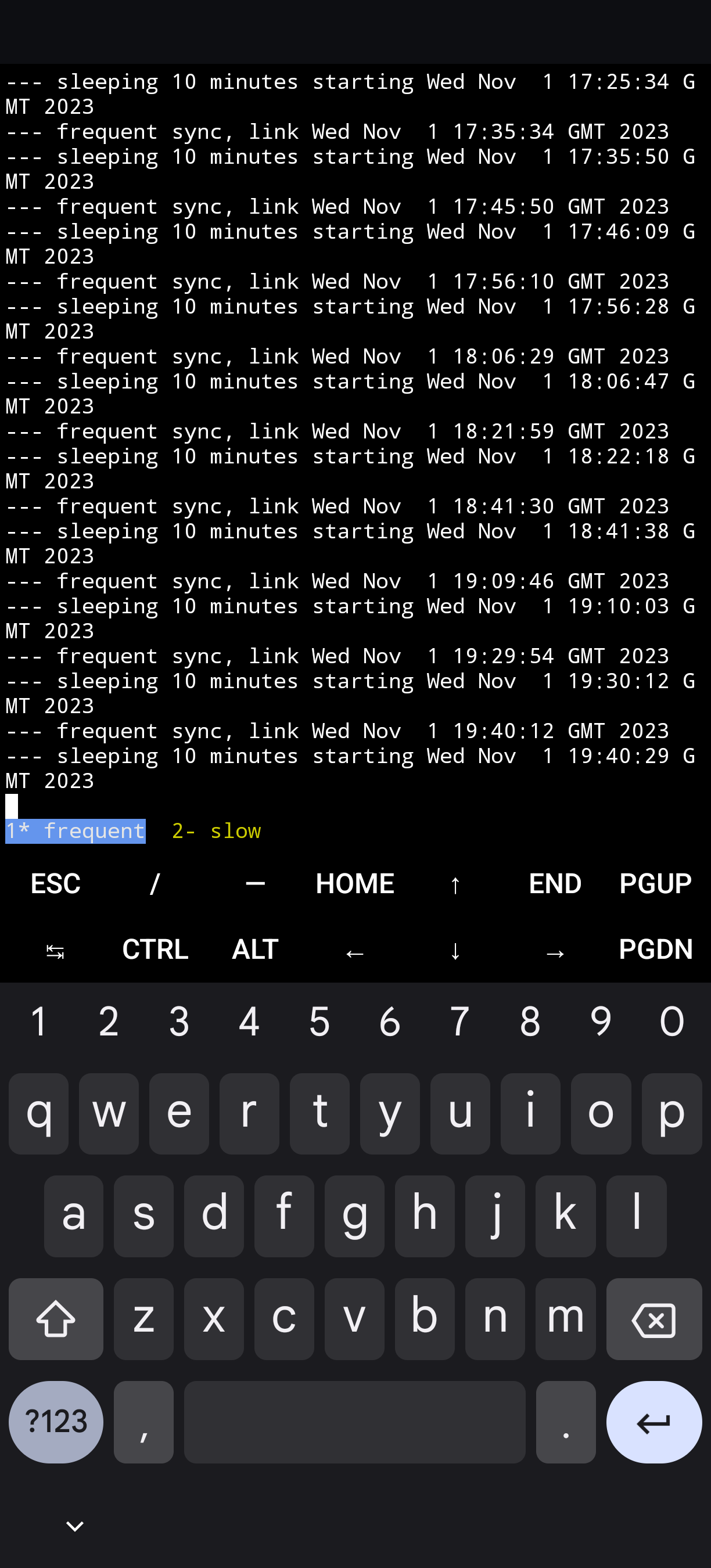
- So what do I do on Android? To my shock the answer is to run an entire Linux command line environment inside an app. You can install any package. This is called Termux and it is a wonder. I run the same script as on desktop to merge / add / commit / push all my documents automatically. It runs in the background on my phone. I was sure this would either not run reliably or drain my battery. It just works.
- I arranged it so other apps can access those files in git – much more flexible permissions system than iOS, but still controllable. Unfortunately I haven’t found a great text editor on Android for my needs – just a decent one.
Syncing ⚖️
- I keep my own photos on my own server, on iOS I would sync new camera photos over SSH with Photosync. This was triggered once again when the power is plugged in – frustratingly, the only time you can automate something.
- For reasons that escape me now, Photosync just didn’t work on Android. So I use two way command line file syncing tool unison, configured as part of the Termux sessions I describe above. It’s great! And syncs my photos frequently.
- I use Fastmail (highly recommend) for my email, calendar and address book. Setting up syncing for that on iOS was a breeze – there’s a standard config file format which Fastmail provide, and it happens in a second. On Android… The assumption is you’re using GMail. So I had to buy a CardDAV/CalDAV sync app, and manually copy and paste all the server names and passwords over. Yeuch.
Miscellaneous ⚖️
- Google Pay works, it’s as good as Apple Pay. I really like that you don’t have to double click the power button to use it – just unlock the phone and hold the NFC reader in the right place and it pays, no other action required. Fairphone has a hardware downside here – the NFC reader is in the middle of the phone, so it is harder to activate than if it was at the end like a wand.
- Google Fit measures cycling automatically. I cycle casually as part of my day to day life, and like to measure the WHO heart points I naturally take each day. On iOS, it kinda did measure cycling as if it was a similar amount of walking, and I tested it and it came out fine. But Google Fit does this better. It knows it is cycling. Otherwise the apps are similar – Apple Health is more flexible if anything. Google Fit is more of a taskmaster demanding I don’t just walk but walk quickly.
- Overcast is one of the best apps there is, an indy podcasting iOS app which I got really used to. Luckily plenty of competitors have cloned its key features of speed adjustment and automatic removal of silence. I’ve gone with Pocket Casts in the end.
Home / Lock / Desktop Customisation 🤖

- Android has gone backwards! For some reason these days (2023) it has little to no lock screen customisation. This just as iOS has gained some of that. I don’t really use my lock screen – on both devices it face unlocks before I can anyway. And on iOS it is just kinda annoying you then have to swipe to get to the last app you were on.
- In contrast, Android has a plethora of home screen apps. These let you do shocking things like move the icons where you like on the page. Radical I know! It’s wild to me that iOS doesn’t allow this. Android even has a standard for customising app icons, with multiple cheap packs to get your phone looking how you want. Like crayon icons or neon icons. It’s a joy.
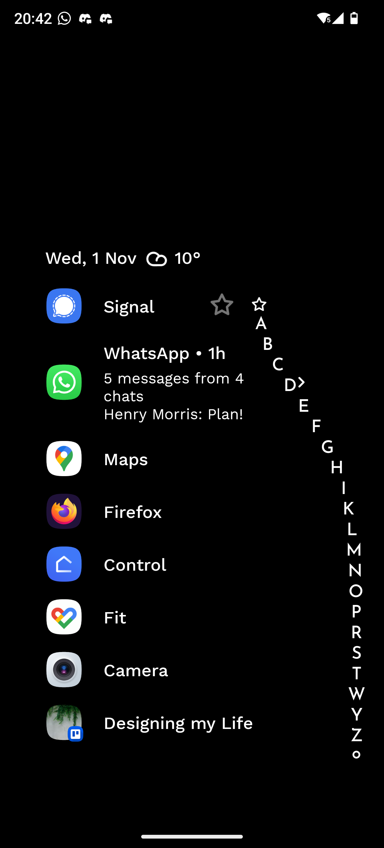
- It gets better. A few weeks in to using my Fairphone I found the delightful, minimalist Niagra Launcher. It’s incredibly well polished, a thought through UI, utterly fresh and new. I feel like I’m choosing how I use my phone, rather than it choosing me. My home page is the screenshot to the right, get me to show it to you.
- A final wild card for Android… Turns out you can just plug it into a monitor. I took the USB-C cable I use with my laptop, and plugged it into my phone. Ping! Android switches to a desktop mode, where the apps are all windows, and there’s a start menu. And I can type into the Termux terminal window. This was very useful – mainly for setting up terminal commands. It’s a bit unloved, looks like nobody has done much with this desktop for a few years. But it works, and is unlike anything an iPhone can do.
Conclusion
Smart phones are a commodity now. It doesn’t matter which you have. And yet, they are different, and you don’t have to use the same one forever.
Every stereotype I had about the two mobile operating systems was wrong – it’s Android that has better user experience polish, and iOS that has the better AI voice assistant.
I like my Fairphone 5. It feels fresh for my mind to learn something new.